Deforestation and Rainfall
Tool to calculate how rainfall changes in South America after different Amazon deforestation scenarios
-
Introduction
“Deforestation and Rainfall” is a tool that calculates how rainfall changes in South America after different Amazon deforestation scenarios. In addition, the tool estimates the potential impacts on economic activities that rely on rainfall, mainly agricultural production (soybean and cattle) and hydro power generation.
“Deforestation and Rainfall” has a responsive and intuitive interface that runs in many browsers as Mozilla Firefox, Google Chrome, Konqueror, Opera, Safari and Microsoft Edge. We recommend Mozilla Firefox, 1024×768 resolution for better interface results
When the application is started, by default, two maps are opened: the 300-km deforestation grid and the Control vegetation scenario (0% of Amazon deforestation).
The deforestation grid is divided in cells identified by a specific number. In the 300-km grid, the first number indicates the line and the second number indicates the column (Figure 1). Ex.: 503-> line 5, column 3; 1003->line 10 column 3. The 150-km grid follows the same scheme, however, an additional number is shown to indicate the position of the pixel in an equivalent 300-km grid. Ex: 503 (1) -> line 5, column 3, pixel 1 of cell 503; 1003(4) -> line 10, column 3, pixel 4 of cell 1003.
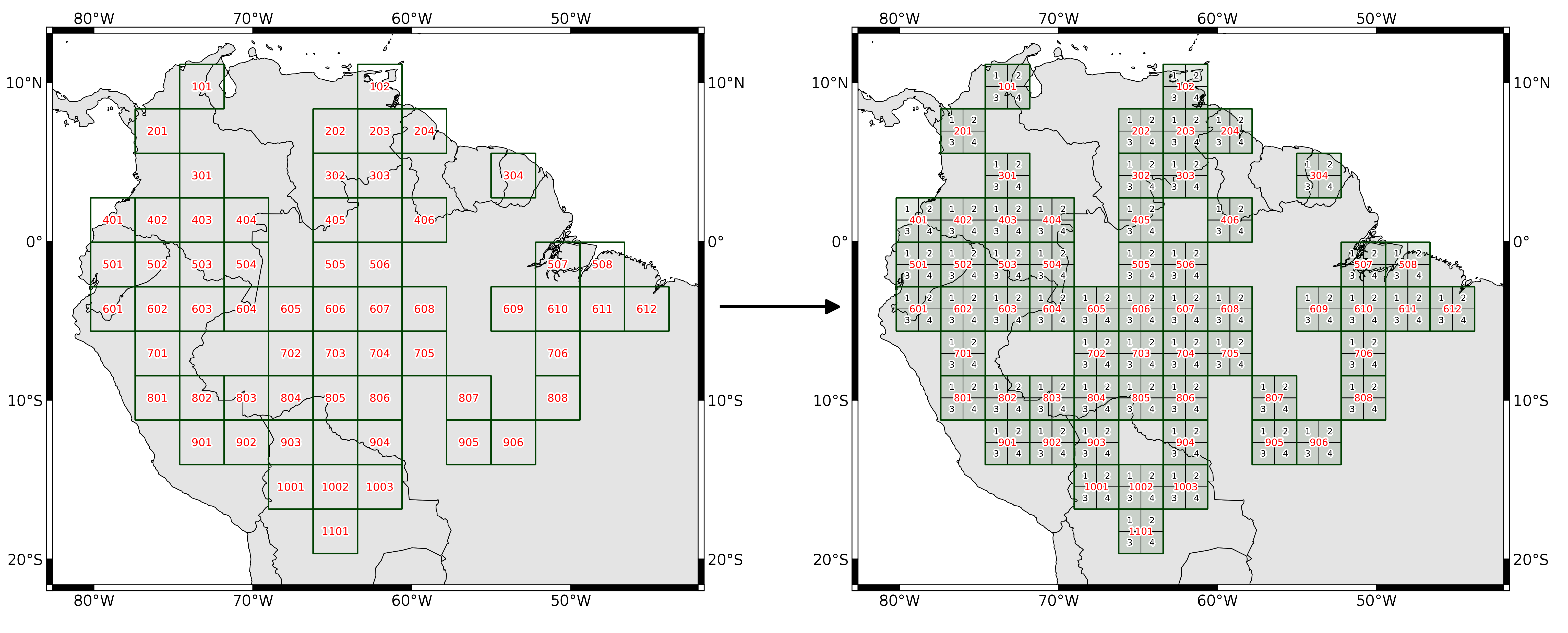
Figure 1: 300 km e 150 km grids (click to zoom in).
The Control scenario includes the vegtypes in South America (Figure 2).
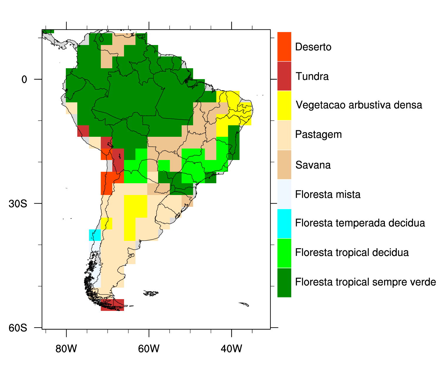
Figure 2: Control scenario (click to zoom in).
-
Interface
Figure 3 highlights the interactive regions in the interface, where:
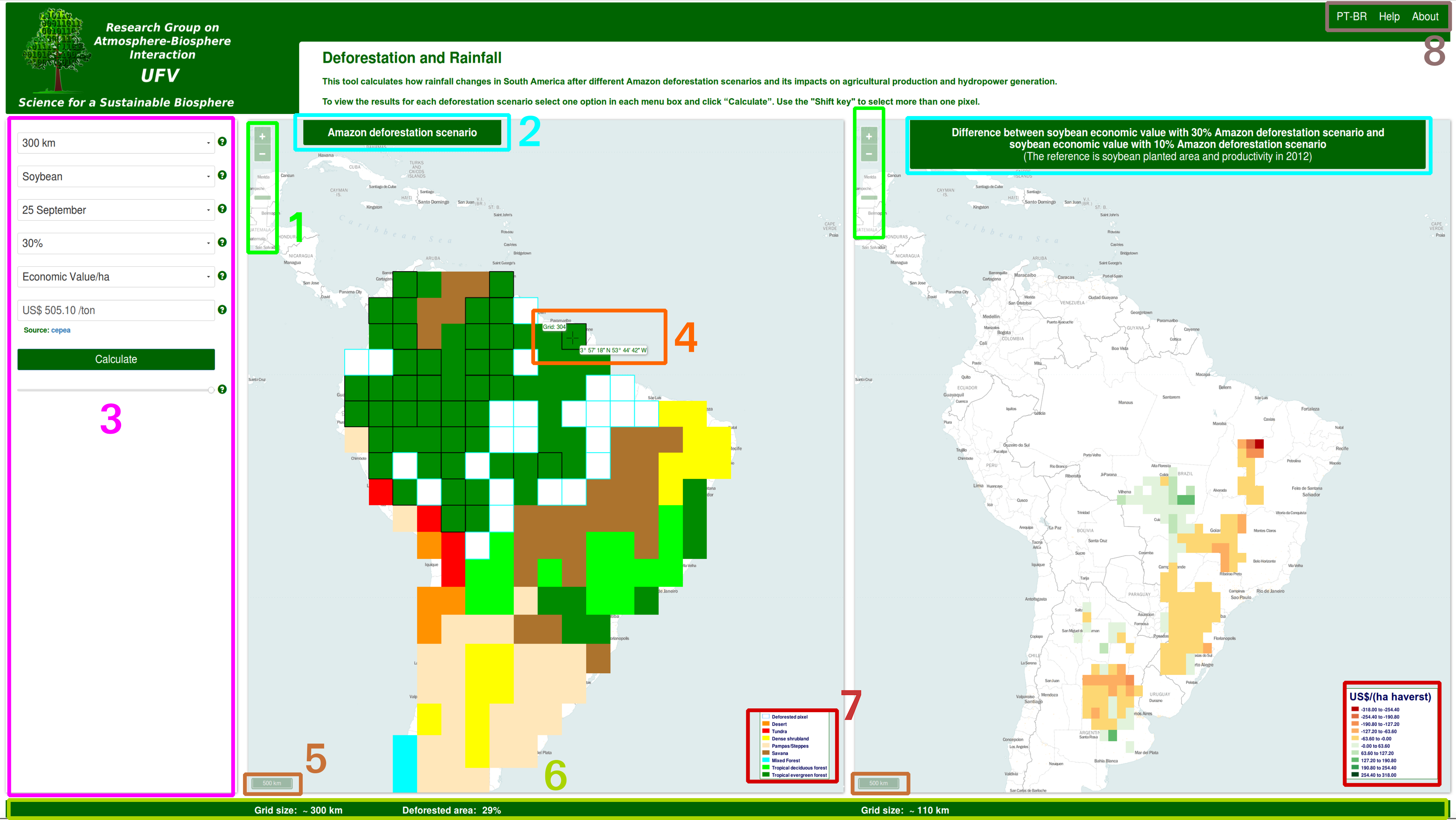
Figure 3: Application interface (click to zoom in).
- Zoom slide;
- Maps title;
- Controls;
- Information on mouse and grid position;
- Map scale;
- Grid information;
- Label bars;
- Language menu and Tool Help.
-
How to use the menu
In the Control menu, the user can combine parameters to create different outputs. To see a demonstration, click here .
The sequence of parameter definition in the menu follows the flowchart below (Figure 4):
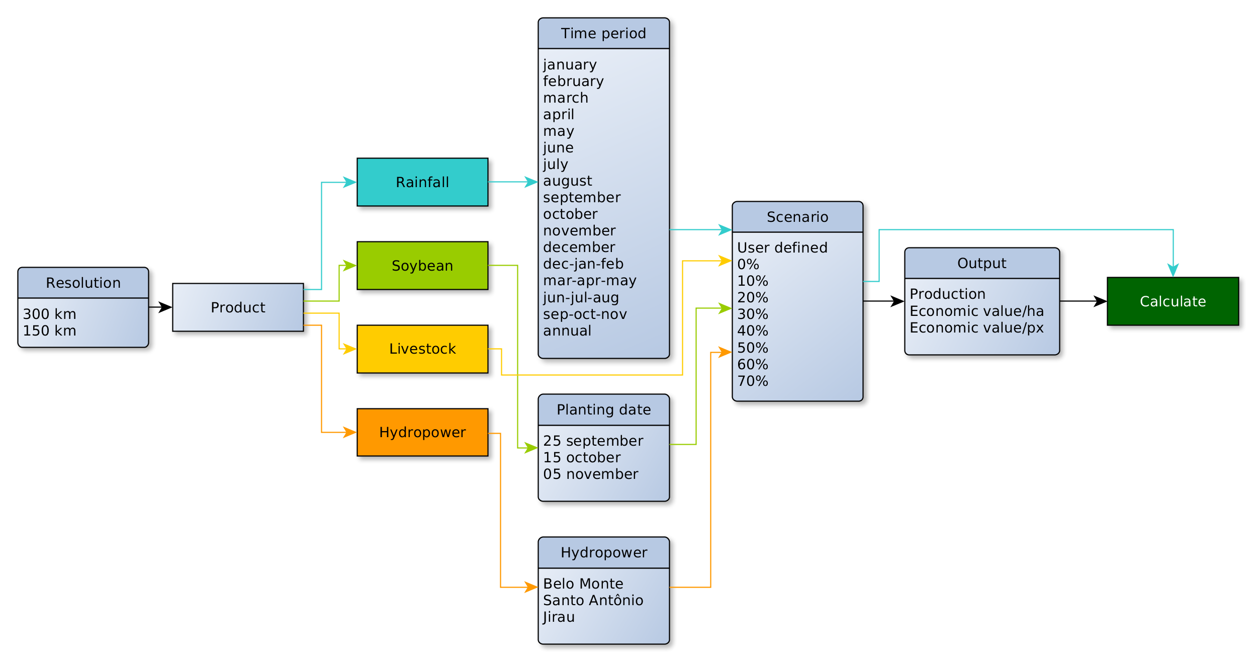
Figure 4: Menu flowchart (click to zoom in).
Moving the mouse over the question mark (?) you can see a short explanation and tips to use the menu option (Figure 5).
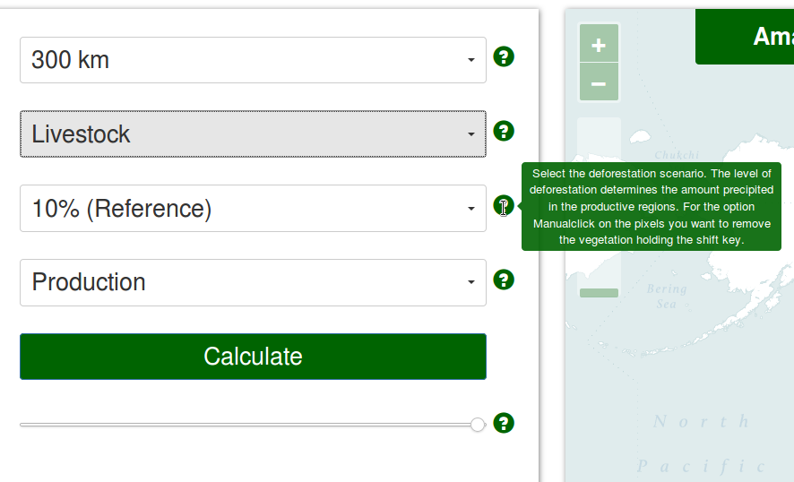
Figure 5: Tips are shown on the question marks (click to zoom in).
All of the commands are controlled with mouse pointers or fingers (tablets and touch screen monitors). While navigating in the maps, the pointer shows the geographical coordinates (latitude and longitude) of the maps. (Figure 6).
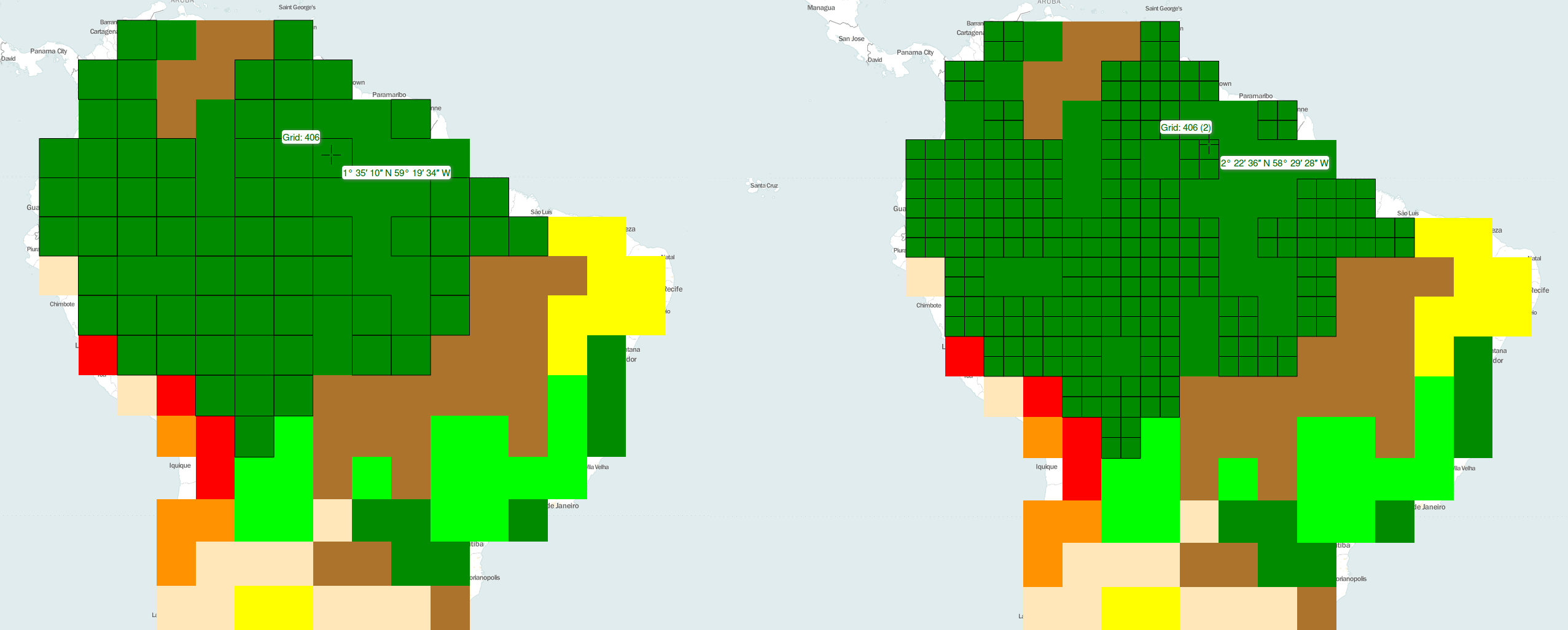
Figure 6: Mouse position in the 300-km grid (left) and in the 150-km grid (right) (click to zoom in).
There are 3 ways to use the zoom tool. i) clicking in the “+” and “ -” signs in the upper left corner; ii) pressing Shift while drawing a rectangle in the region of interest or iii) using the scroll mouse (Figure 7).
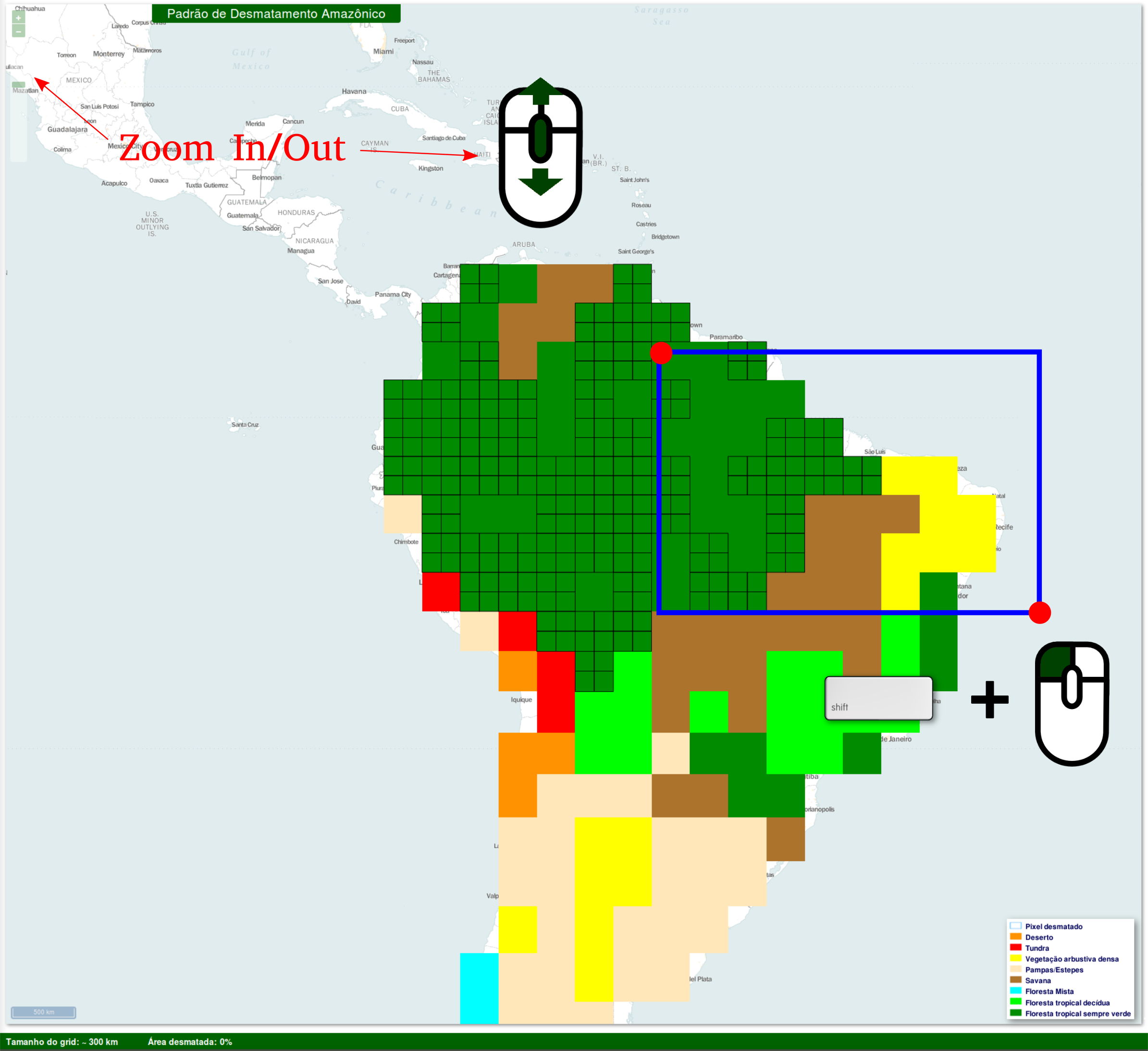
Figure 7: Zoom In/Out using zoom buttons, the scroll mouse or drawing a rectangle (click to zoom in).
Application menu
The tool is available in English or Portuguese. To view information about the tool and the developers choose “ About” (Figure 8).
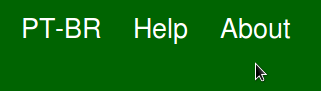
Figure 8: Application menu (click to zoom in).
Deixe uma resposta